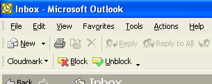
I recently received an email about the NewsGator menu in Outlook, which right now is added to the main Outlook menu bar. The person pointed out that if all add-ins added their menu to the main Outlook menu, we’d have a mess on our hands…and he suggested perhaps moving the menu to the NewsGator toolbar. SpamNet does this now – the “Cloudmark” button on their toolbar drops down their menu:


Seems like a reasonable idea, and a nice side effect would be it would eliminate the menu bug we have on Outlook 2000; but there’s something nice about just having the top-level NewsGator menu also. I’m on the fence.
What do you think?
Personally, I prefer the menu to the toolbar. I’ve much more room for items on the menu bar than toolbars, and actually turn the toolbar off and use keyboard shortcuts to activate the menu. IMO, toolbar clutter is just as problematic as menu clutter.
Are there Office guidelines for Add-In user interfaces?
I’m in favor of moving it off the top-level menu bar. Can it be moved to a cascading menu item off of the Tools menu? That might be preferable to having it on the toolbar.
For what it’s worth, both Groove and Spam Bully drop down their menus from toolbar buttons.
One problem with putting it on the menus, whether a main menu or a sub menu, is there’s no way to reserve an accelerator key. So depending on what ELSE is installed and what language of Office the user has, it may or may not be possible to use the keyboard to access it even if it is on the menus.
I like Kevin’s suggestion. It’s too bad there’s not an “Add-Ins” submenu in Outlook like there is in Access.
<< One problem with putting it on the menus, whether a main menu or a sub menu, is there's no way to reserve an accelerator key. >>
Actually, I believe the opposite to be true. Having it on a submenu *decreases* the likelihood that there will be a conflict, because the scope is reduced to just that menu/submenu.
It is toolbar keyboard access that is more problematic. There, the hotkey *is* global, unlike for submenus, so the probability of conflict is higher than on a submenu. Unlike most Windows apps, there is a (non-hotkey) way to access the Outlook toolbar via the keyboard, but I bet that the percentage of people who know it is infintessimal. :-)
<< it may or may not be possible to use the keyboard to access it even if it is on the menus. >>
This is not true. Menu items are *always* accessible via the and arrrow keys, even in the absence of hotkeys. Most if not all keyboard access folks are familiar with this.
Penultimate sentence above should read “Menu items are *always* accessible via the _alt_ and arrrow keys”.
Hey, Greg, can you get this comment thingamajiggie to support line breaks? :-)
Pingback
If your menu bar gets cluttered can’t you just go into the “Customize” dialog and drag one of the offending add-on menus to another toolbar?
I prefer the menu as it is now. I really do not see my Outlook menu growing.
Mark: That only works until you restart Outlook. My guess is that add-in rebuilds the menu on startup, discarding any customisations.
Strongly in favor of moving it to a button on the toolbar. Be a good neighbor.
This has been interesting…I’ve gotten a lot of responses in email, and some more here, and it seems folks are about 60% in favor of the current menu, and 40% in favor of moving it to a toolbar.
FYI, for 1.1 (should be released in a week or so), the menu will stay in its current position; however, we’re keeping this item open, and we may change it for a later version.
Please, please give us a toolbar-free UI option. The mouse is a terrible HID for frequently accessed features — it’s always been about UI discoverability, not UI usability — news aggregators are the killer app for the keyboard!
As a user, once you reach that level of enlightenment, the very next thing you want to do is turn off all toolbars — LCD pixels are the most expensive component of a modern PC, and that lone little newsgator toolbar is wasting thousands of them. I want it to go away, so I can have those pixels back.
You can just right-click on the Outlook toolbar, and turn off the NewsGator toolbar, if you don’t want it there…