Tag Archives: review

Sparrow

If you haven’t yet seen it, Sparrow (Mac app store) is an email client for the Mac that really focuses in on great Gmail support, and has a very different UI than Apple Mail. Ever since Sparrow was released, there has been a lot of chatter about it; nearly all of what I have read has been very positive. I’ve been using the app every day for about six weeks, and I wanted to post my thoughts about it.

If you’re a heavy email user, then you can’t take switching email clients lightly. You know all of the keyboard shortcuts of your client, and if something changes even subtly you will notice. Consistency and reliability are the most important traits. No one likes sitting around in their email app, so anything that helps you get in and get out quickly is what you’re looking for.

I’m not going to walk through how Sparrow works – there are videos on the web site you can watch, or you can read many reviews around the net going into detail on the app.

These are the things I found good about Sparrow, as a user who had been using Mail:

  • It’s very pretty. It looks more like Twitter for Mac than Mail, at least when you’re just looking at the message list.
  • It works really well with Gmail. There is a button for archiving, and shortcuts to label and archive. It displays conversations quite effectively.
  • Just added in 1.2, the Universal inbox feature was a great usability enhancement.
  • It has a great quick reply feature, where it opens a control for you to type a response without having to pop up a whole message window.
  • It’s “different”, and somehow more “fun”. I can’t quite put my finger on it, but there’s something satisfying about using it.

But not everything is roses. Here are the things that gave me fits:

  • It’s not so smart about image attachments. I took a screenshot of a window to email to a friend, and pasted it into a new message in Sparrow. It sent it as a 7MB TIFF file…but when I paste the same thing into Mail, it pastes in “actual size” as a 45KB PNG file. Needless to say, defaulting to a multi-megabyte TIFF is unexpected.
  • I have a colleague using Outlook on Windows, who sends me a regular email that has two attachments (a docx and a xlsx file). These do not make it into Sparrow intact, but rather show up as a “winmail.dat” attachment. Yikes – I thought this problem was behind us! I actually have to open these messages in the google web client to read them.
  • No spotlight integration. For me, this is a big one, because I use spotlight all the time…
  • I’m not sure I can put this down as a “con”, but some of the animations in Sparrow which are very sexy when you first get started, become less endearing as time goes on. Expanding out the message pane, for example, could be a little faster. I also notice choppy animations when having a new message window animate across multiple screens on my Mac Pro. This isn’t the end of the world, but it’s the little things that you notice day in and day out.

The first three issues on the list above are enough to have made me finally switch my accounts back to Mail. Proper encoding and decoding of attachments is pretty much table stakes in this game, and Spotlight is something I’ve grown to expect of an app like this as well. It’s a little bizarre to me that they’ve spent time adding things like Facebook integration (still not sure why I need that), as opposed to really solidifying the app, but clearly they have a vision in mind.

So I’m back to Mail. To help make Mail more usable with Gmail, I’ve added the Archive button plug-in, which adds a button and a keyboard shortcut to archive messages. So now, “delete” sends a message to the trash, and “archive” archives it to “all mail”, which is exactly how I would expect it to work. This alone has made Mail so much more usable with Gmail and Google Apps.

As for Sparrow, I’m not giving up on it, but I’ll wait for some of the problems and usability issues to get worked out. And I’m really looking forward to trying Mail in Lion, which looks like a major upgrade over prior versions.
Do More Faster

If you haven’t yet, you should take a look at Do More Faster, a book by Brad Feld and David Cohen about the experiences of early-stage investors and entrepreneurs.

I’ve even got a chapter in there myself, called “Don’t Plan, Prototype!” It’s essentially a couple of pages talking about the very early stages of NewsGator, from the sitting-around-scratching-my-head stage up to our first venture financing. I wrote it and slipped it into a stack of manuscripts David had laying around…somehow they didn’t notice, and it made it into the book. :)

Anyway, you can pre-order the book now at Amazon. Check it out!

My take on Apple’s Magic Mouse

Never one to let new toys sit on store shelves too long, I picked up a Magic Mouse as soon as they were available in the local Apple stores. I was one of those rare folks who actually liked the mouse-formerly-known-as Mighty Mouse, so thought I’d write about it from that perspective.

First, I love the scrolling action when you slide your finger on the mouse. _Love_ it. I also find that I really like the momentum scrolling option, which, like the iPhone, dampens the scrolling effect when you lift your finger rather than stopping abruptly. I thought I’d hate the momentum (makes sense on the iPhone, but on a computer?!?), but it didn’t take long to get used to it, and then like it, and then actually be bummed when it didn’t work well in an app. The only app I’ve found so far that it doesn’t seem to work well in is Tweetie; I think it is actually working, but it’s so highly damped that you can’t really tell. [I saw a tweet from Loren saying he’s waiting for his mouse to come in so he can work on it.]

If you want to stop the scrolling abruptly, like other mice, just don’t pick up your finger when you’re done scrolling…and it will stop in its tracks. Perfect.

The only scroll-related gotcha I’ve found is when you’re in an app where you can scroll down one line at a time (the example for me is the ThinkOrSwim trading app, looking at level 2 quotes, trying to scroll down one line at a time)…with the mighty mouse, it was easier to scroll down just one line, or three lines, or whatever you wanted. With the magic mouse, it’s still possible, but takes some finesse, which I haven’t mastered yet.

The other thing I really like is the fact that you can use the whole surface of the mouse for scrolling. Sometimes I’ll be reading a long web page, and take my hand off the mouse. Now when I want to scroll down a bit, I don’t have to position my finger right on the scroll ball, but in fact can just stick a finger anywhere on the mouse and scroll around.

Right-clicking on the magic mouse works exactly like it did on the mighty mouse, which works well for me. The two-finger swipes to go back and forward in a browser do work…but I haven’t trained myself to do it yet. It’s a touch awkward now, IMHO, but who knows, maybe I’ll grow to like it.

I do miss the extra buttons on the mighty mouse, which I had assigned to dashboard and expose. My hope is that Apple maybe adds some options in the mouse preferences to re-map the two-finger swipe to other functions, so we can customize the behavior to our liking. Or perhaps there are other gestures the mouse can recognize that just aren’t implemented in the driver yet. I’m not holding my breath, though. :-)

All in all, I like it a lot. I’ll probably end up buying another one for my other computer now. And, in case you want one, here are make-me-rich Amazon links for the Magic Mouse and the wired mouse!

After a day with the Kindle for iPhone

By now, you’ve undoubtedly heard about Kindle for iPhone. It’s pretty cool, actually…pretty bare bones functionality, but it tries its best to get out of the way and let you read.

Yesterday evening, I was meeting someone at Starbucks, and she was running about 15 minutes late. I was fiddling with my iPhone, and remembered that I had the new Kindle app on there, and had already downloaded the book I’m currently reading on the “big” Kindle.

I opened the app, which was already on the page I’m currently on. I read for a bit, and actually finished a whole chapter before my friend arrived. When I was done, I closed the app, and it did its magic sync back to the Amazon cloud with the page I had made it to.

When I got home later, I turned on my Kindle just to see what would happen. I clicked into the book from the home screen, and a message popped up saying something like “you’ve read up to location 2500 on gregr’s iPhone; would you like to move to that location now?” (those weren’t the exact words, but pretty close). I clicked yes, and that’s all there was to it – I was exactly at the point I left off earlier.

Pretty cool – better than I expected. I can totally imagine reading a bit of my book when waiting for an appointment, standing in a long line, or something like that.

So the good and the bad?

Good:

– Pretty much does exactly what you’d hope. You can read your book, and the rest of the GUI disappears.

– It’s free!

Bad:

– While the “swipe” is intuitive to change pages, it’s not very much fun after you’ve done it 50 times in a row. They should make it so if you tap somewhere, it skips to the next page.

All in all – it’s not the same as a Kindle, or similar to a book for that matter. The screen is small, and it’s backlit and less comfortable to read, at least for me. I wouldn’t want to read a whole book on this screen myself – but for short breaks, it works quite well. And somehow, I feel like my e-books are worth more now that I can read them in multiple places. :-)

My Thoughts on the Kindle 2

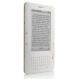
Kindle 2Pretty much everyone and their uncle has written about the Kindle 2 now. Not one to be left behind, I wanted to write down my thoughts.

I never had a Kindle 1. I looked at a friend’s once, and read some reviews and such, but that was the extent of my experience. But when the Kindle 2 started shipping last week, I ordered one. I’ve now read about one and a half books on it, and wanted to write about it.

First, why did I buy one? Well, a few reasons:

1. I like to read bestseller types of books, usually paperbacks; I don’t like hardcovers as much, as they’re too big to fit in my bag, and more expensive. But, this means I’m usually a year or so behind my favorite authors. With the Kindle, the brand new books (otherwise only available in hardcover) are only about $10.

2. I travel a lot, and I like to read on planes. But don’t you hate it when you only have 40 pages left in a book when you get on, so you have to take two books? And, to add to the problem, I’m a procrastinator, which means I’m always perusing the airport newsstands looking for a new book…and if there’s nothing there that sounds good, I have to settle for something that doesn’t.

3. I’ve got hundreds of old paperbacks piled up in my house, and have no idea what to do with them. Can’t really sell them, as they’re generally not worth anything. I could give them to friends, but I’ve got more books than I have friends who read the same genres. And based on past experience, with only a couple of exceptions, the likelihood of my re-reading one of these books later is approximately zero.

So…in came the Kindle.

My first impression? It’s thinner and lighter than I thought. I also got the leather cover for it, which snaps onto the Kindle with a couple of metal clips. I’ve heard a lot of complaints about this cover, but it seems to work fine for me.

Downloading books works as advertised – and it’s truly seamless. Seems to take about 20 seconds for a new book to download, which I can’t complain about.

The menu system seems painfully slow. I think it’s just the nature of the display, in that updates take a while. This doesn’t affect the reading experience at all, though – so it’s only when you’re in there screwing around do you notice it.

So on to the reading experience. I was a little nervous about this; I actually read an e-book on an iPaq way back in the day, and it was somewhat painful…enough so I only read one. So I was a little apprehensive about the Kindle. I asked Brad about his – he said it took him about 5 Kindle books, and then he was ambivalent as to whether he read a new book on his Kindle or on paper. That didn’t sound so bad.

So I sat down on Saturday, downloaded a new book, and started reading it. At first, everything seemed weird…but then, actually very quickly, the Kindle sort of disappeared and I became engrossed in the book, just like I do with a paper book. The screen contrast was fine, the paging controls were convenient enough, everything just worked, and got out of the way. By the time I was halfway through the book, I was noticing how it was actually more comfortable than a regular book in some ways…for example, you can hold the Kindle, and page through it, with one hand.

It makes buying new books a little too easy. Similar to the Apple TV (which I will write about one of these days), the Kindle is like a cash register that’s hooked up to Amazon.com. Genius in that way.

I do wish it had more screen and less keyboard…but I suppose you can’t have everything. It should have come with a case, and maybe a credit for a free book. But once you get past all that, get your case, order a book, it works. Really well.

So all in all, I’m liking the Kindle a lot. It’s small, light, and should be easy to travel with. I don’t notice it when I’m reading. It just works.

(Note – Amazon.com links in this post are affiliate links; if you use one to buy something, maybe I’ll make enough to buy a new book!)